Question 16

From Biology HL Paper 1 (May 2024, TZ2)

  1. The graph shows the correlation between atmospheric carbon dioxide concentration and global temperature anomalies (deviations from mean global temperatures) since the industrial revolution to the year 2017.
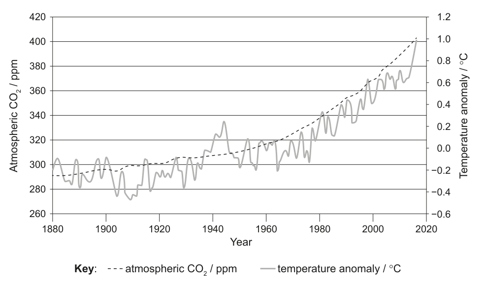
A line graph displaying two data series: atmospheric CO2 concentration in ppm (left y-axis) and temperature anomaly in °C (right y-axis) against Year (x-axis) from 1880 to 2020. The graph shows an increasing trend for both CO2 and temperature anomaly over this period.

Which statement explains the correlation between atmospheric carbon dioxide concentration and temperature shown in the graph?

Textbook topics in this question

Review the exact course sections assessed by each question part.